
by W.A. SteerĀĀPhD
Ā

Contrary to popular belief, "colour" is not really an intrinsic property of the things we see around us. Rather, it is the sensation resulting from a given spectral distribution of light, detected by the three colour-sensors in the eye and interpreted by the brain. This page presents a practical overview of colour-science, dispelling some myths along the way and providing some of the best graphics on the subject on the web!
Eye sensitivity - colour matching functions
Experiments in the 1920's enabled the response of the eye to be characterised. Essentially they involved getting students to match spectral colours (monochromatic light) using a colour made by adding varying proportions of red, green and blue "primaries". Many colour-science textbooks begin by explaining this experiment in great detail; I think this is a huge source of confusion so will say no more on the subject for now, and simply present the net result.
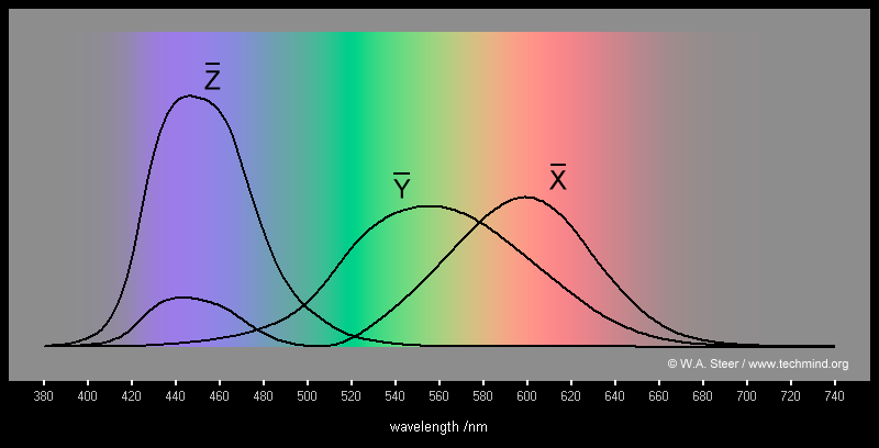
CIE 1931 Colour matching functions for 2° observer
The three CIE colour matching functions (CMFs) are called Xbar, Ybar and Zbar, and
for practical colour matching and display applications these can be treated as if they were the spectral response curves for the cone-receptors in the human eye. [Actual response curves for the eye are slightly different, but are closely mathematically related.] While it is convenient to think of X, Y and Z as red, green and blue, owing to their wide band and substantial overlap (especially of X and Y), this is a crude approximation. Furthermore, the X (red) function has a second lobe in the shortwave end of the visible spectrum!
It is important to note that because of the overlap of the functions, they are not fully independently stimulable, i.e. no physical light source can stimulate one channel while maintaining zero in the other two (although you can get close with the X channel by stimulating it with longwavelength red light).
A "colour" is defined by the relative stimulus of the eye's XYZ channels (the actual magnitudes will define the brightness or intensity). It makes sense therefore to define a colour by an xyz triplet which are normalised versions of XYZ:
| | X | | | Y | | | Z |
| x = | ----------- | | y = | ----------- | | z = | ----------- |
| | X + Y + Z | | | X + Y + Z | | | X + Y + Z |
Of course, by definition now, x + y + z = 1 . As such, only two out of the three xyz coordinates are needed to uniquely define a colour.
It is conventional to define colours by their x,y coordinates. This then gives rise to the CIE chromaticity diagram...
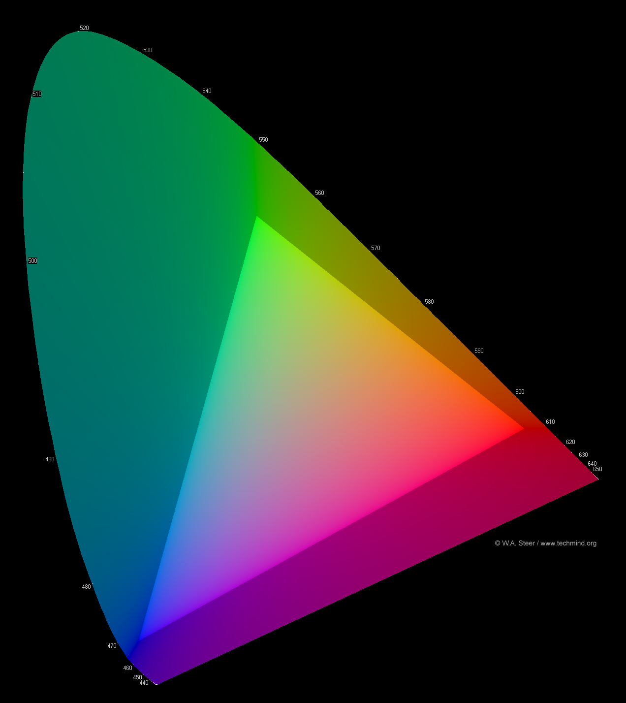
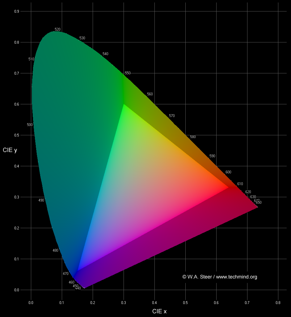
1931 CIE Chromaticity diagram
The chromaticity diagram plots the entire gamut of human-perceivable colours by their xy coordinates defined earlier.

1931 CIE Chromaticity diagram
- The inverted-U shaped locus boundary represents monochromatic light, or spectral colours (loosely rainbow colours). [Wavelengths shown in nm]
- The lower-bound of the locus is known as the line of purples and represents non-spectral colours obtained by mixing light of red and blue wavelengths. In reality this boundary is not hard, as the colours just become dimmer and dimmer owing to the falloff in sensitivity of the receptors of the eye at the extreme ends of the visible spectrum.
- Colours on the periphery of the locus are saturated; colours become progressively desaturated and tend towards white somewhere in the middle of the plot. The point at x = y = z = 0.333 represents the white perceived from an equal-energy flat spectrum of radiation.
- Any colour within a triangle defined by three primaries can be created (or recreated) by additive mixing of varying proportions of those primary colours.
- The brighter triangle in the centre of my plot shows the colours which can be reproduced by a standard CRT television or computer screen. The vertices have the colour-points of what are known as Rec.709 primaries. The colours accessible to a given display-device are known as its gamut.
- Colours outside my triangle are said to be out-of-gamut for, and cannot be reproduced on, normal display screens (or even recorded in many common image file-formats). They are artificially desaturated in the plot above. Standard monitors are particularly incapable of reproducing saturated greens and turquoises. Mathematically, colours outside each edge of the triangle require a negative amount of light from the opposite primary. Clearly this doesn't make physical sense; what it means, essentially, is that the primaries defining the nearest edge themselves "contain" too much of the opposite primary colour.
- I have taken great care to render my plot such that colours within the triangle will be displayed accurately on a PC with an sRGB-compliant monitor with white point set to 6500K whose brightness and contrast controls are properly set, assuming no (non-standard) system gamma control is in force.
- For all its simple derivation from eye-response functions, the 1931 CIE chromaticity diagram is not perceptually uniform. That is to say the area of any region of the plot does not correlate at all well with the number of perceptually-distinguishable colours in that region. In particular, the vast area of green-turquoise inaccessible to televisions and monitors is not -quite- as serious as it appears.
Other colour-space coordinate systems and plots exist; examples include CIE 1976 u,v, also CIELUV, CIELAB... in general, by means of fairly abstract transforms these attempt to be more perceptually-uniform (with only limited success). Their use is fairly specialised. The simple and direct relation between CIE x,y and the eye-response functions probably accounts for its enduring popularity.
I think nicely-plotted chromaticity diagrams are very attractive, as well as educational, so will oblige in making some high resolution versions available for download...
- CIE_sRGB_hires.jpg - without axes
- axes_cie1024.png - with axes
- To do: add plots with/without scale, different resolutions, aesthetic desktop etc. (will eventually be on a separate page)
You often see badly plotted (misleading and/or seriously chromatically inaccurate) chromaticity diagrams; see my Rogues Gallery for examples of what often goes wrong, and why!
Colour in the real world
- The colour of any light-emitter (bulb, flame, spark, discharge, LED, phosphor, backlit-LCD, etc.) can be completely and unambiguously defined by a CIE x,y coordinate.
- The colour appearance of any passive (reflective, non-emissive) material (paint, paper, magazines, photographic prints, fabrics, skin, fur, leaf, petal, etc.), or any transmissive filter (e.g. stained glass) can be defined by a CIE x,y coordinate only under a given source of illumination. The colour appearance of reflective materials is intrinsically related to the spectral power distribution of the light source (you have to multiply the spectral power distribution of the light source wavelength by wavelength with the spectral reflectance). The most obvious and extreme example of this effect is illumination from low-pressure sodium streetlamps - all objects simply take on varying shades (brightnesses) of orange. Artists using traditional materials sometimes do their indoor work under special bluey-tinged lamps; these are designed to mimick the spectral distribution of daylight, and hence render similar colours from their materials. Sometimes a figure known as the colour rendering index (or just CRI) is quoted for (usually florescent or LED) lamps; this gives some indication of the accuracy of reproduced colours compared to a conventional lightbulb (strictly a blackbody radiator).
More detail on reflective or transmissive colour is beyond the scope of this guide!
Colour in computers, television, and graphics
Gamut
Different display technologies (CRT, florescent-backlit LCD, LED-backlit LCD, plasma panel, inkjet printer, laser printer) can have inherently different colour gamuts. Good colour-management practice can ensure comparable reproduction of many colours, but very saturated colours, even if obtainable on one device, are likely to lie outside the gamut of another. All strategies for dealing with out-of-gamut colours involve a "fudge" of some sort.
The primary colours of laptop computer, PDA, and mobile-phone displays are often less saturated than those found on mains-powered equipment. This allows greater brightness at a given battery-life, but reduces the available colour gamut by shrinking the triangle on the chromaticity diagram.
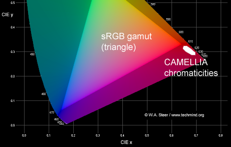
Any red, orangey or yellow coloured lightsource or reflective surface which has essentially no energy at wavelengths
shorter than around 550nm will have a visual colour lying right on the edge of the chromaticity diagram locus, and thus
outside the sRGB gamut. Yellow and orange flowers such as daffodils and pansies are examples. Furthermore, the deep
red petals of flowers such as a rose or camellia often lie outside (below and to the right) of the red-corner of
the sRGB gamut. This is one reason why in photographs you may find it difficult to obtain satisfactory-looking colours
of some types of flowers.


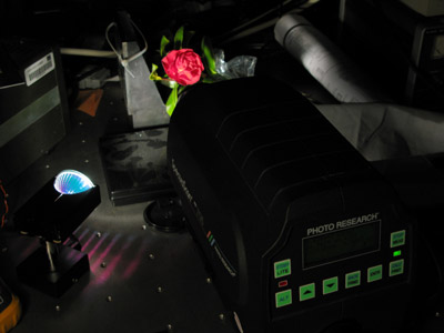
In the photo on the left my camera has rendered the camellia brighter and more orangey than
in real life, while in the different lighting on the right it has come out too pink (desaturated). When I illuminated
this flower using a quartz-halogen spotlight and measured colours from it using a precision spectrophotometer I obtained
a spread of colour-coordinates with several readings extending down to CIE x=0.68, y=0.30 .
On a related topic, I've written a page illustrating the problem of reproducing realistic-looking "rainbow" spectra on a display.
Whitepoints and Colour-temperature
While a white object simply reflects or scatters all colours (visible wavelengths) equally. Defining a 'white' light source
is slightly less straightforward... I've written a page with notes on whitepoints and colour-temperature.
Brightness and contrast
You have little hope of getting accurate colour reproduction on your television or monitor if you brightness and contrast controls are improperly set. Charles Poynton is eager to lecture you on this; see http://www.poynton.com/notes/brightness_and_contrast/index.html. Unfortunately the exact effect of "brightness" and "contrast" controls on LCD monitors is very poorly defined (sometimes the "brightness" control adjusts the backlight brightness, and sometimes that is a separate control...) and some experimentation may be required.
Gamma
RGB values used on computers (typically in range 0-255) and analog and digital TV signals are almost guaranteed not to be directly proportional to light output from the screen. The eye/brain does not respond linearly to light intensity, but approximately logarithmically. RGB values are conversely non-linearly scaled so that they approximate to "equal" steps of perceived brightness. This non-linear scaling of RGB data is known as gamma-coding.
Any image-processing or manipulation process ought to be aware of the particular gamma-coding parameters in use, if brightness- (and hence colour-) errors, and other artifacts, are to be avoided.
Again, Pointon has some good notes on gamma processing and standards: http://www.poynton.com/GammaFAQ.html.
The sRGB specification (see below) for monitors and PC graphics attempts to standardise a gamma-coding and RGB primary set.
Further reading
http://www.poynton.com/ - website of Charles Poynton; digital imaging considerations
http://www.cie.co.at/cie/ - website of the CIE
http://www.w3.org/Graphics/Color/sRGB - sRGB specification
http://www.cis.rit.edu/mcsl/online/cie.php - CIE matching function raw data, including in 1nm (interpolated) steps
Created: October 2004
Last modified: 15 March 2008
Source: http://www.techmind.org/colour/
©2004-2008 William Andrew Steer
andrew@techmind.org